McMan Calgary
Redefining the digital brand identity for a shifting age demographic.
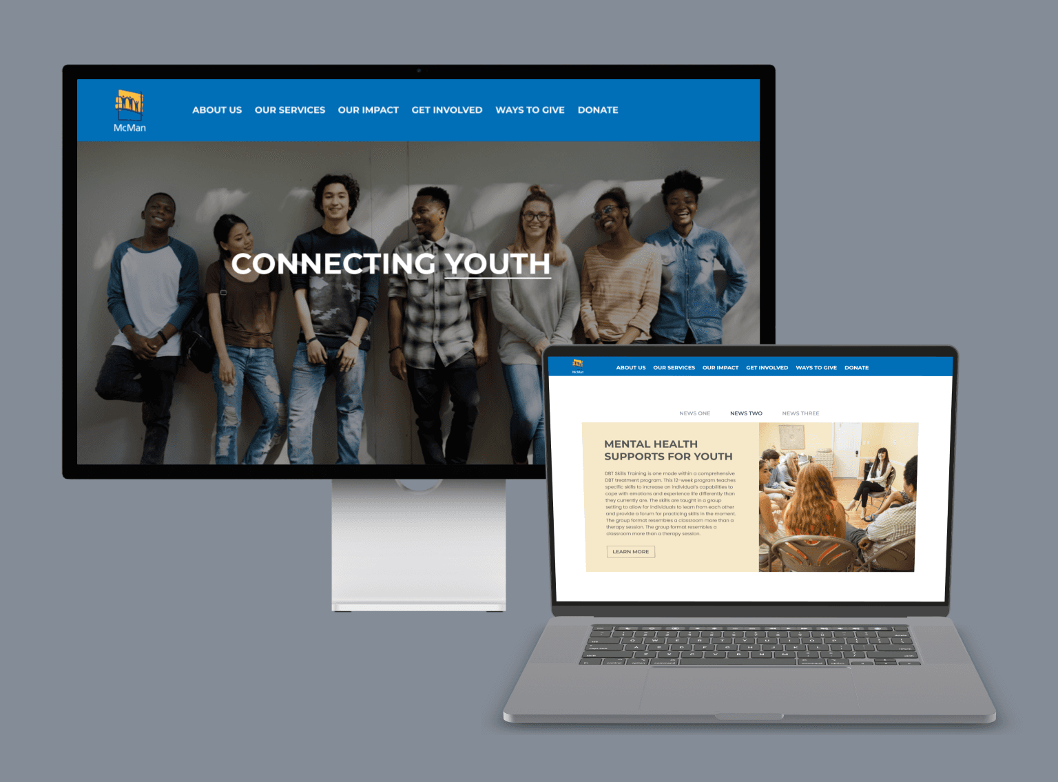
Overview
McMan Calgary & Area works with children, youth, and families in the social services sector, where they provide numerous programs and resources for underserved peoples. During my summer internship at McMan Calgary & Area, the median age in the office was around 38 years old, and it was difficult to attract kids and teens to a specific program as a result of our online branding.
I worked to prototype a full redesign of the existing website in order to align with the current brand, improve user experience, and increase engagement.
Role: UX Designer
Wire-framing, Prototyping, Web Design, Interaction Design, Visual Design
Timeline
2 months (July - Aug 2023)
The Problem
McMan's website was their most prominent outward-facing platform, with all program registrations, contact information, and resources available on there. However, this website was out of date branding wise, and failed to attract younger audiences: at the time of my internship, the newest program targeted teens specifically, and was struggling to gain the traction it needed. This was due to the poor user experience, making it difficult to navigate to the right pages, and the outdated branding that discouraged younger audiences from browsing the site.
The Solution
Since McMan already had an established brand book that I was not allowed to deviate from and our website was hosted on WordPress, my design process was pretty simple and I was able to work entirely within an existing system :) The solution was a complete overhaul of the existing website and pushing the flexibility of the brand book, as well as re-aligning on user experience to ensure seamless navigation.
I loosely followed a double-diamond design process, adapted to fit within my time and resource constraints.
Discover
Learning as much as we can about the problem and the status quo!
Problem Discussions and Framing
I started off by setting goals and success metrics to guide my design process and understand the purpose of this project,
Goals
I wanted to present a refreshing and modern brand identity while staying in line with our brand book and company history. Additionally, cleaning up the site copy and updating the information was crucial to creating a modern representation of our company. I wanted to improve SEO and readability. Lastly, one of the main goals was to engage the target audience and present our services in a way that appealed to teens and young adults.
Create a modernized brand identity
Clean up outdated information
Engage target audience
Success Metrics
As a website, success is measured in website traffic and page views, and as a company success is measured in how effective our services are. Our success metrics would be seeing an increase in program sign ups, specifically programs targeted towards teens and young adults, and an increase in site traffic.
Increased service/program sign ups
Increased site traffic
Branding Research
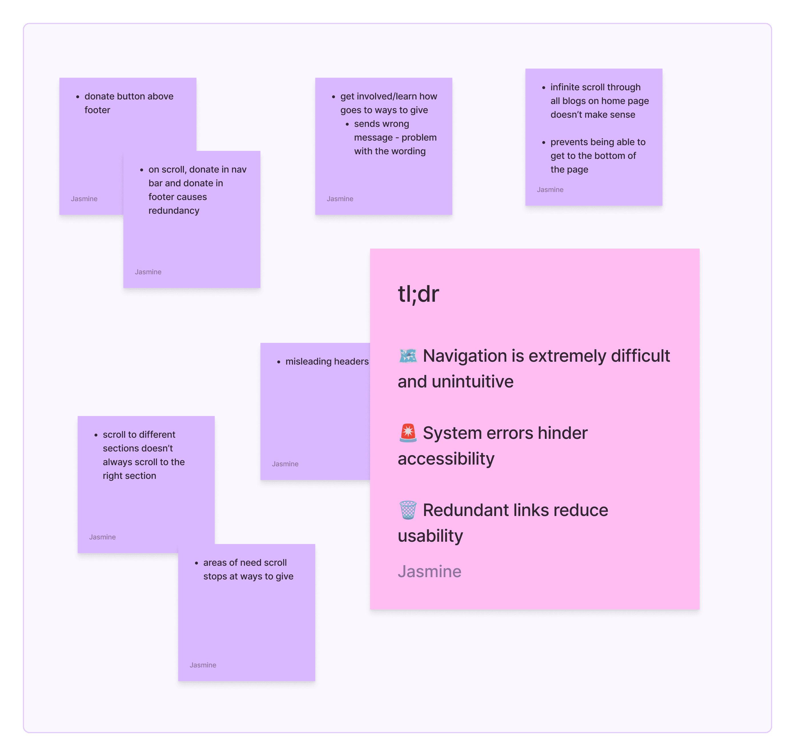
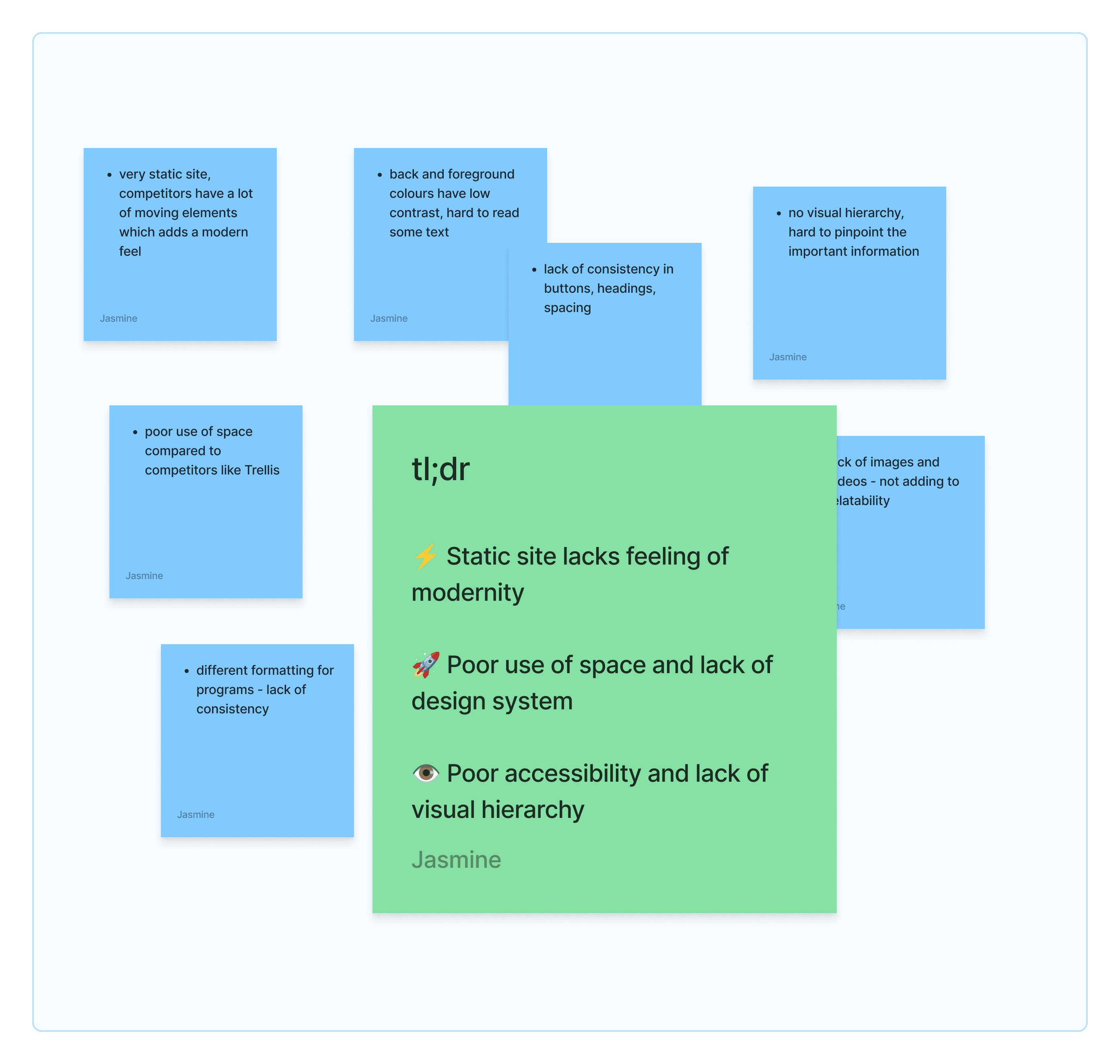
The first thing I did was conduct some research. Acting as a user, I explored McMan's existing website to see if I could easily find the information I wanted to and if I could leave the website with a holistic understanding of McMan as a company. Afterwards, I consolidated my findings to a Fig-jam and sorted the problems I discovered by UX related and UI related. I made a few key observations: the site was outdated, there was poor use of space, and poor UX led to being unable to find pages.
UX Observations
UI Observations
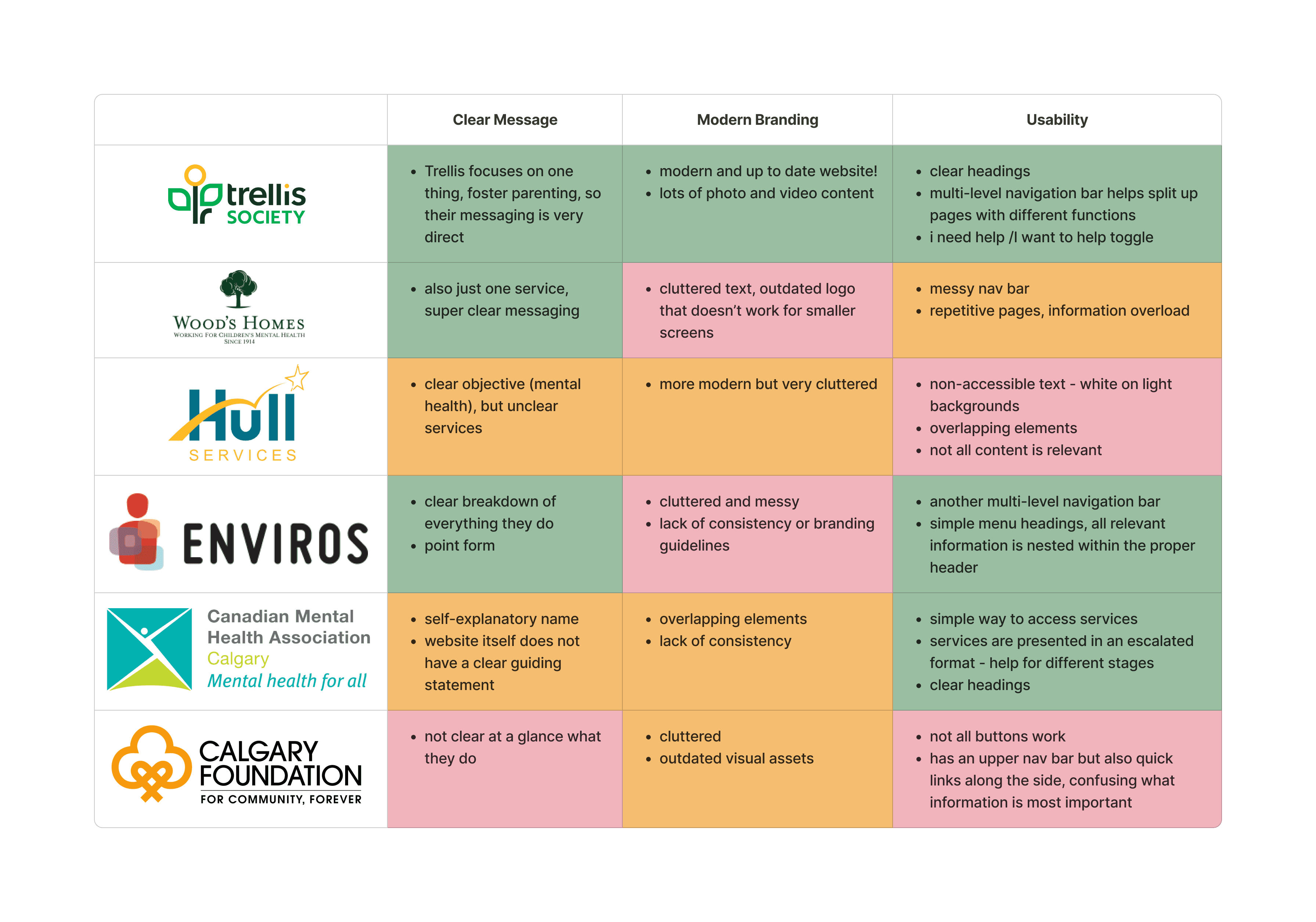
Competitive Analysis
Next, I conducted a competitive analysis to see where we were falling short with other companies in the field and what we could learn from their brand identities.
Current Site Design
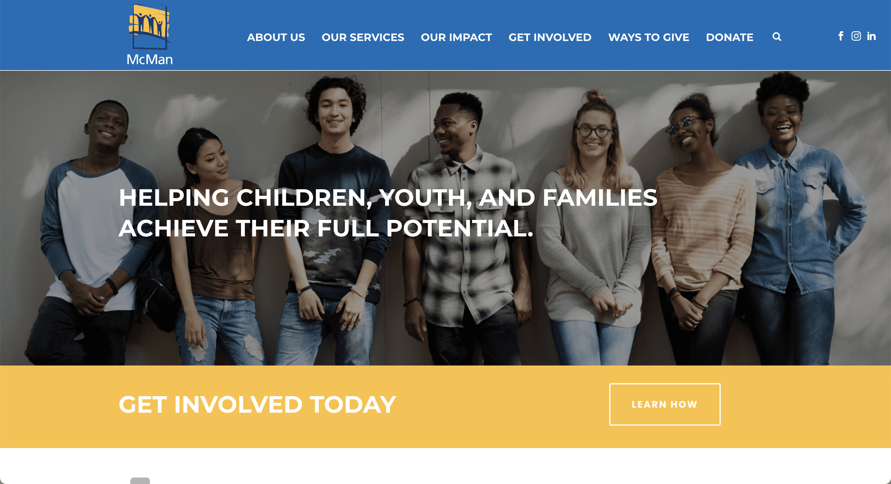
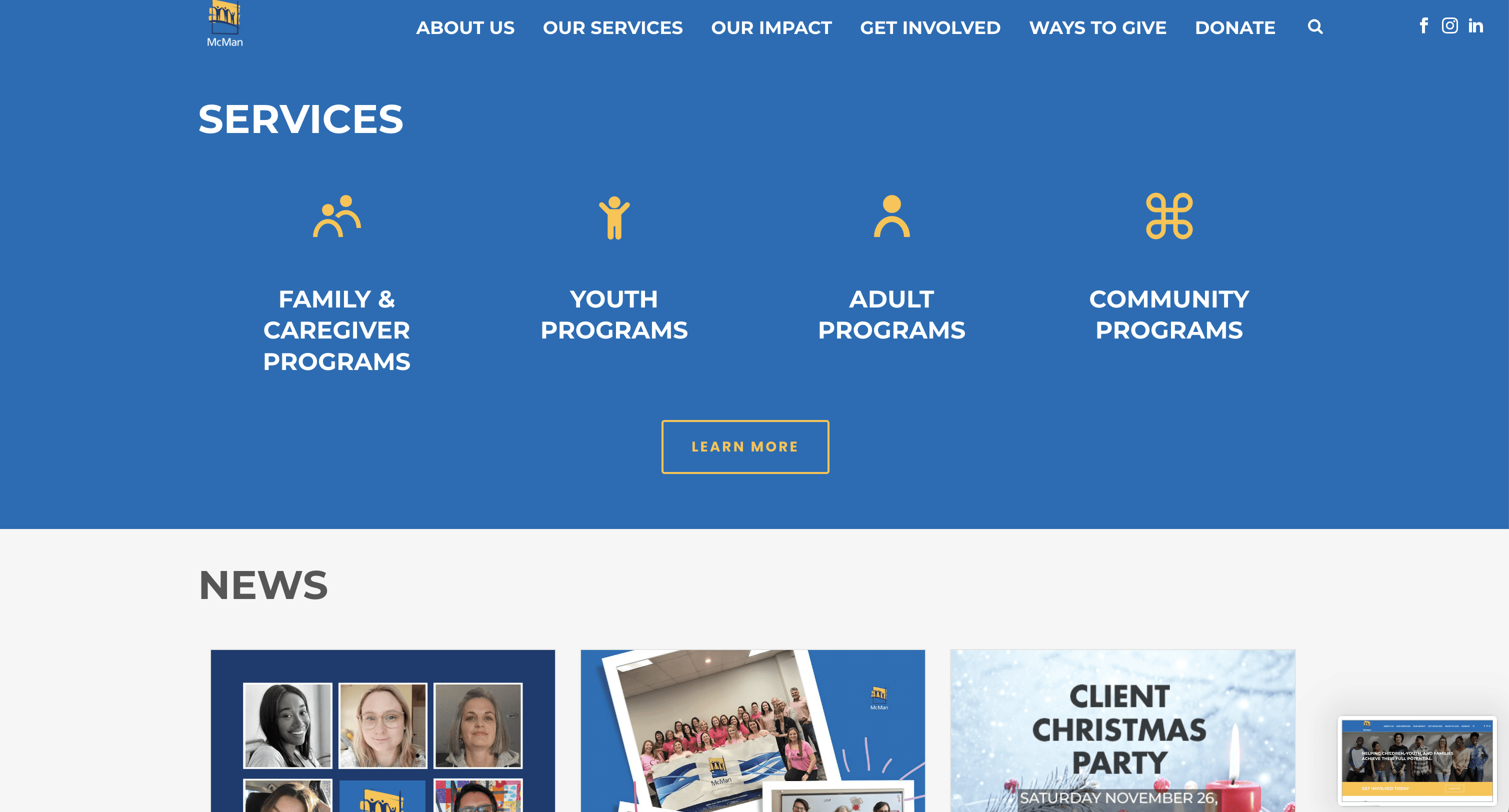
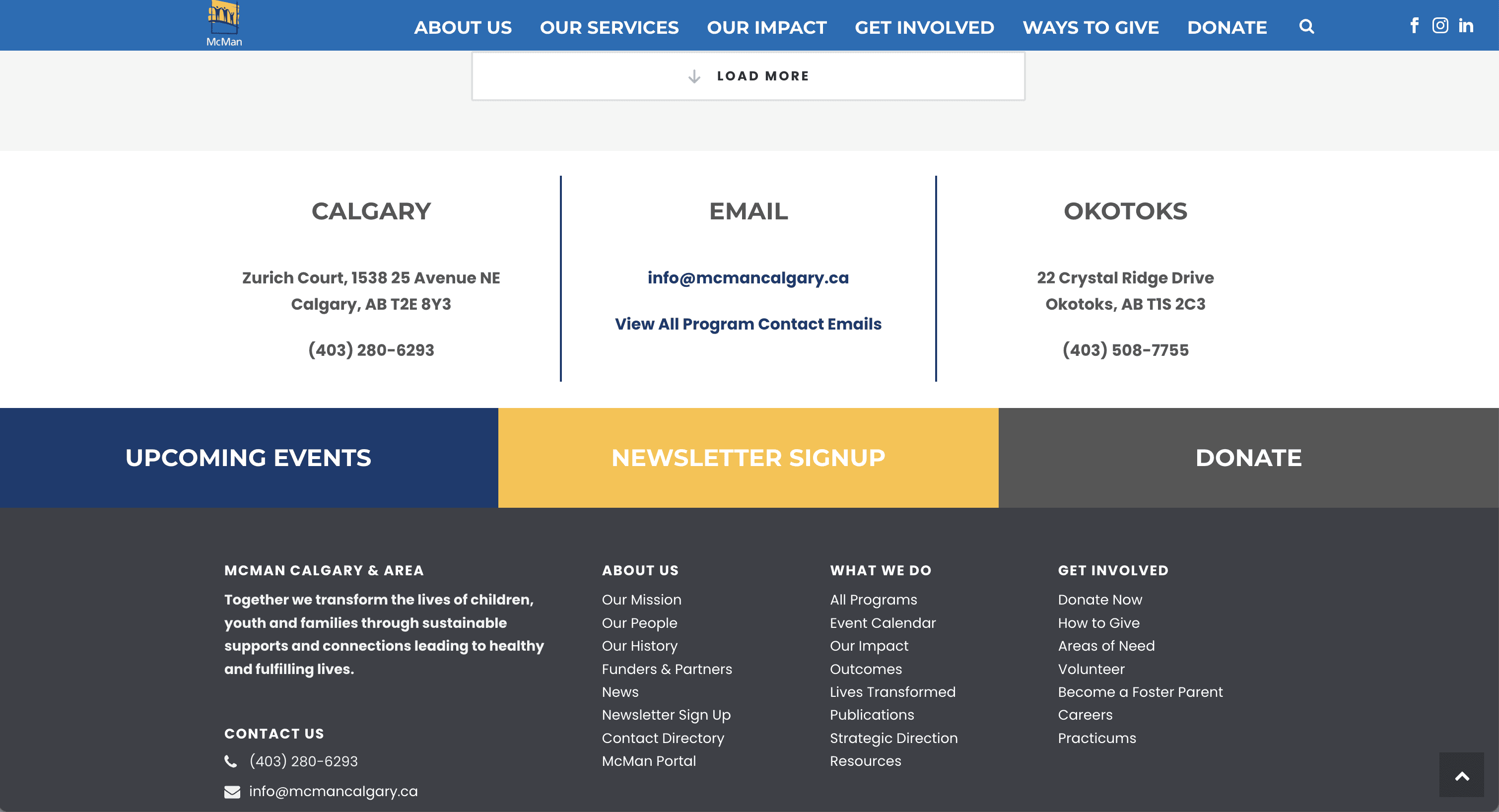
When taking a look at the current site design, it's obvious that there is a lot of clutter. The homepage does not clearly convey a message or share any information about what our programs do. The news segment can infinitely load more, which is a poor design choice for a landing page, and the amount of information in the footer is overwhelming as well as irrelevant as most of the information is already available in the top navigation bar.
Old Site Map
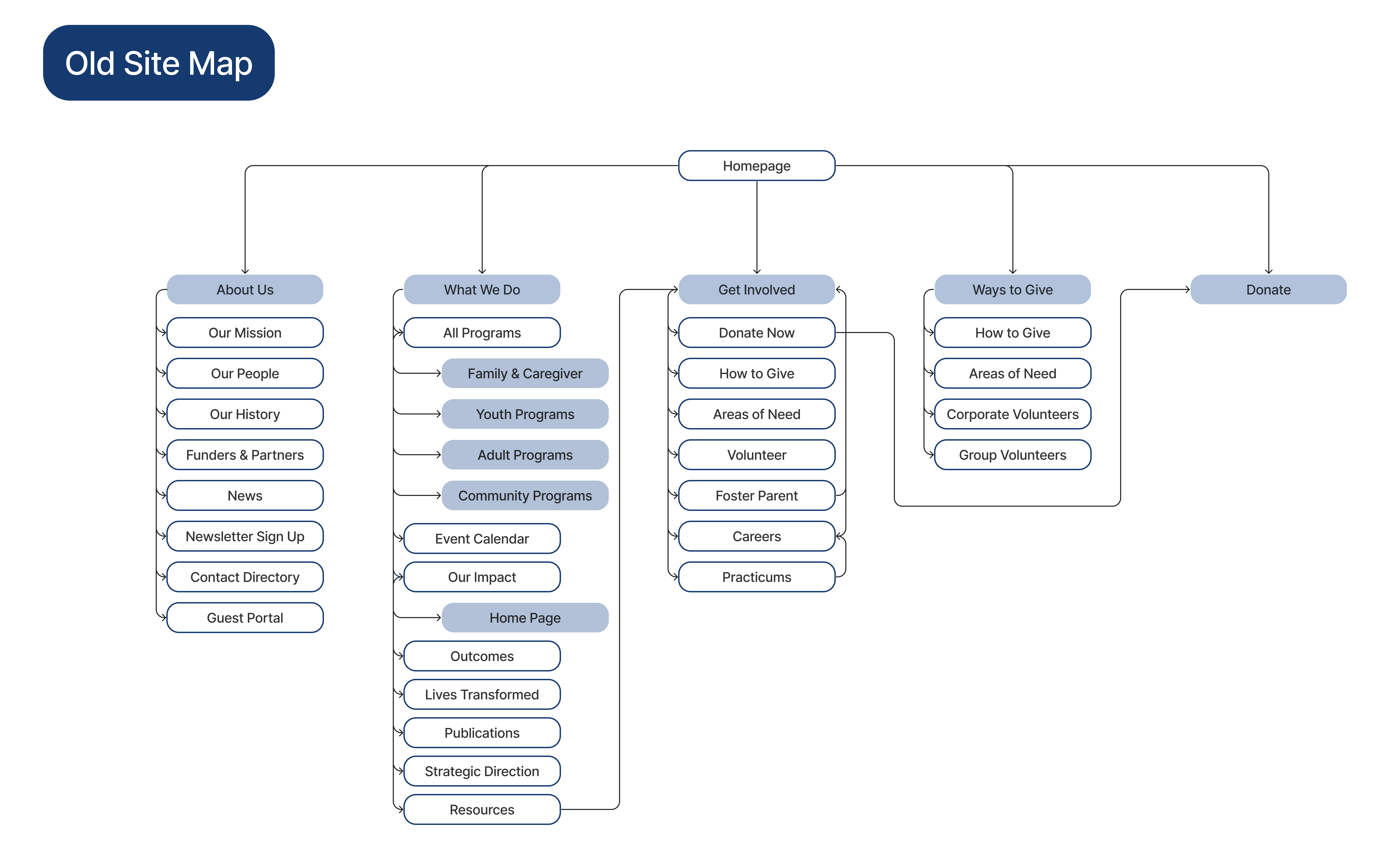
One of the first things I noticed when going through the website was that it was incredibly difficult to find different pages and the nested menu items in the top navigation bar were misleading. Since this was reaffirmed when I compiled my research, in order to prepare for the design process I created a site map to figure out where everything was located and to see where improvements needed to be made for a more user-friendly navigation.
Define
Establishing our problem statement and direction.
Key Features and Changes
In order to prepare for the design process, I outlined a few key changes I wanted to make, and drafted a guiding problem statement.
Improved flow on landing page. Seamless integration of photos, videos, and information rather than blocked out one after another.
Making navigation easier. Adding more intuitive user flows such as individual links for different services instead of nested general links.
Adding an upcoming section to easily promote upcoming events, programs, opportunities. Increasing visibility on important information.
Guiding Problem Statement
How might we fully redesign and modernize an existing website to generate higher engagement and improve user experience, while staying true to the existing brand identity?
Design
Exploring ideas, possibilities, and solutions.
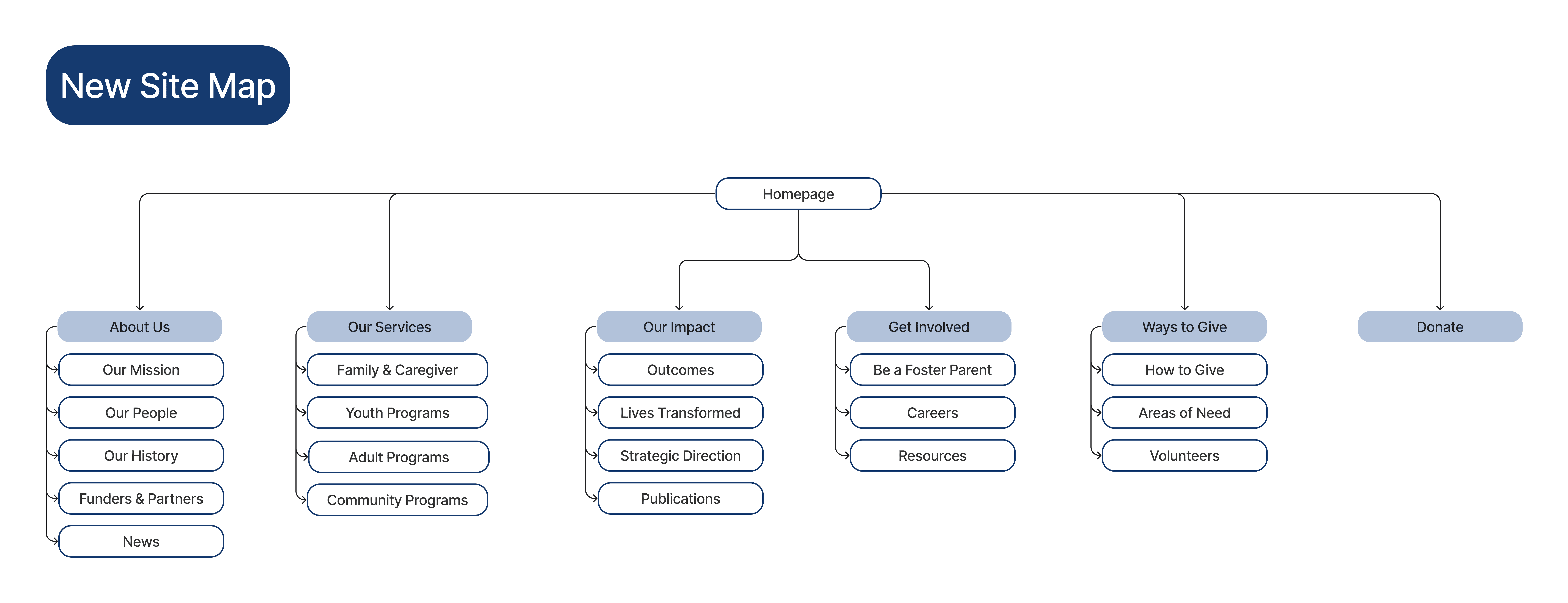
New Site Map
In order to declutter and create more intuitive user flows, I created a new site map to follow. A focus on this was to make sure each header in the navigation bar conveyed enough information for a user to be able to understand what the nested pages were, and to make sure each page either redirected to a new page or was combined with something else to reduce repetitiveness.
Wireframing
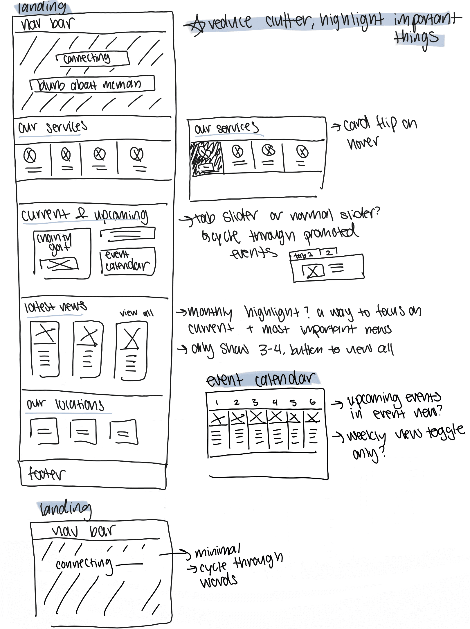
I began sketching wireframes for a possible redesign. I first took a look at WordPress to see what the different design capabilities were, and I took inspiration from the available animations. I wanted to make sure every aspect of a section was visible on one page length to make better use of space and create a clear looking interface. One of the most important things to keep in mind was that the purpose of the website redesign was to highlight important information and events, leading me to create a "Current & Upcoming" section that can be easily updated to reflect current promotions.
Mockups
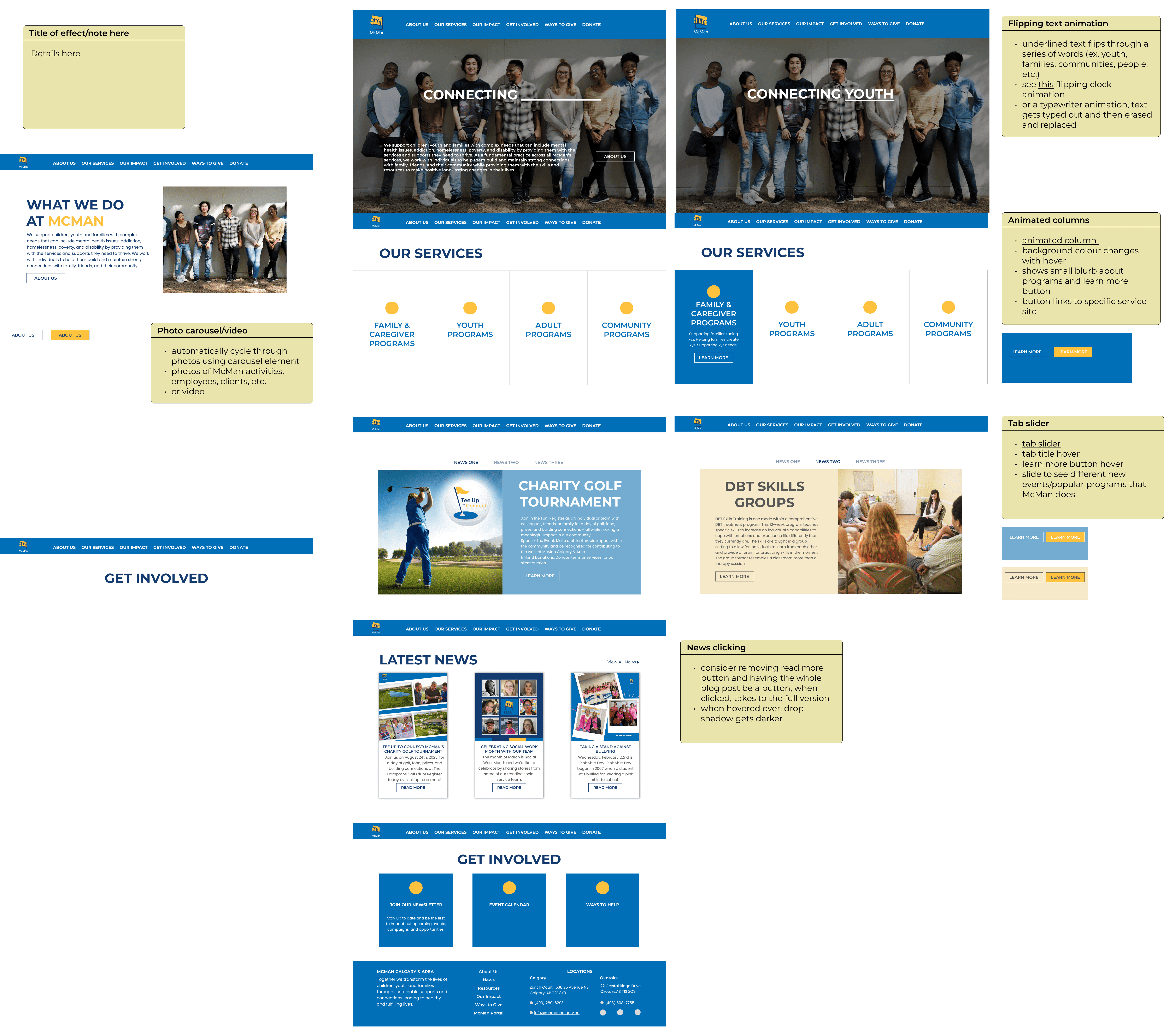
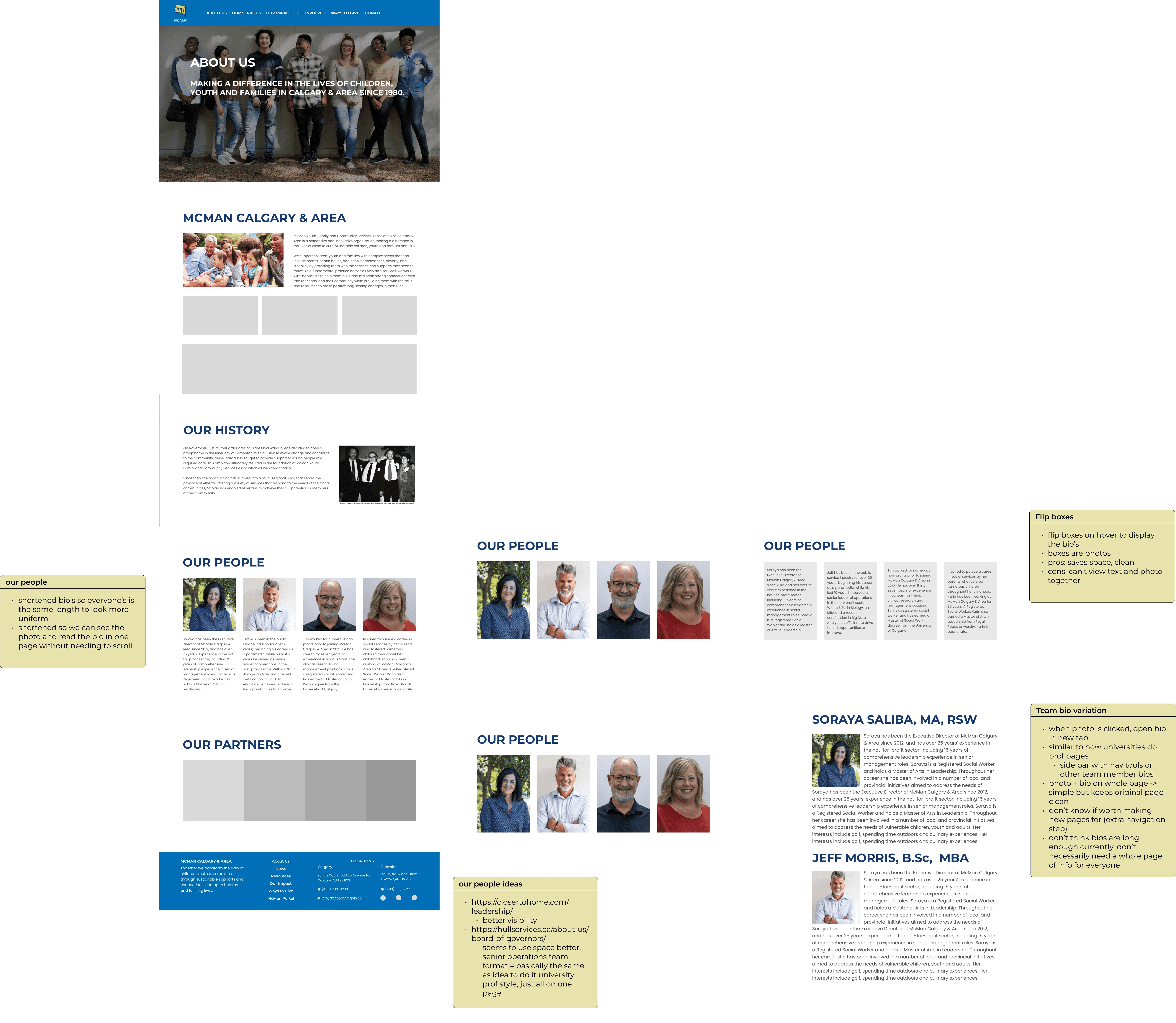
I started to mock up the designs in Figma, using sticky notes to indicate the different WordPress animations that would be used in implementation. Although in the end I didn't have the time to develop the About Us page in WordPress before my internship was over, I did start on a mock up of a redesign for the page.
I was inspired by modern company websites that featured big backsplashes and a sleek, minimalistic look. At the same time, I needed to adhere to the brand identity and still convey the core values of the company. McMan is a youth and family charitable organization, so I needed to be mindful that our website still felt inviting and like a safe space. I did this by including more images of people as well as testimonials. I mainly prioritized cleaning up the current website in my redesign, giving it a more clear user flow and updating the copy to reflect our values.
Homepage
About Us
Deliver
What are the next steps, improvements, and implementations?
Testing and Improvements
One major improvement I would have made is to do more testing. Due to the timeline and lack of availability, I was unable to test mockups on anyone on my team as my internship ended before I could see the project through to the end. I would have loved to do usability testing on the original website versus my prototype to see how the UX improved and if my team was able to make their way though set tasks.
Since I was working within a very strict design system and the functionality of the website was limited to built in features in WordPress, I had to be very creative with how I was using the space to convey the brand identity. Another improvement I would hope to make is further explore customizing WordPress features to serve our purposes. There were numerous features I would have loved to implement but they needed to be adjusted to better fit our needs, so working on my development skills there to be able to customize the platform would be a next step!
Final Design
McMan: redefining the brand for an established company
A minimalist and modern interface. Key information is displayed right on the landing page, and information can easily be swapped out for new events or promotions. Animations provide a clean and uncluttered way to display more information in the same amount of space.
Reflections
The biggest things I learned on this design journey.
Space and Spacing
As my first web redesign project, I learned a lot about the importance of space and spacing, and how to use spacing in order to highlight different things. The original website was very cluttered largely due to allocating too much space to sections that were less important, so I got to learn a lot about spacing for website layout and design.
Designing With Flexibility
This project challenged me in a lot of ways, but especially because it felt like the goal of the redesign, to modernize the website, was completely at odds with the existing brand book, and I had to figure out how to use the outdated brand book and create a modern website. This forced me to be flexible, challenging me to play within WordPress' built-in animation features and working to leverage space to create a modern feel where I couldn't with colour or typography.
How Different Types of Design Fit Together
I initially walked into this project expecting to be doing a simple redesign of the website - maying moving some sections around, adding some photos. What I wasn't expecting was to discover so many UX issues! This project taught me a lot about taking UX design outside of its box and applying UX knowledge to other types of design. I learned more about the design space and how every avenue of design ties in with one another in order to create one solution.
